The Interface options are available to help control the size of the avatar relative to the browser and edit the location and style of the interface controls.
Displayed Title #
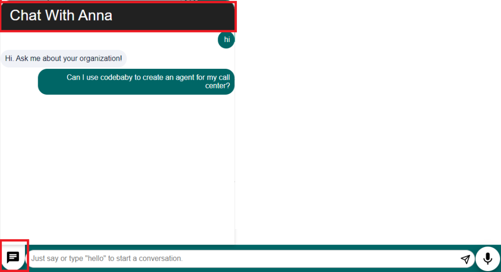
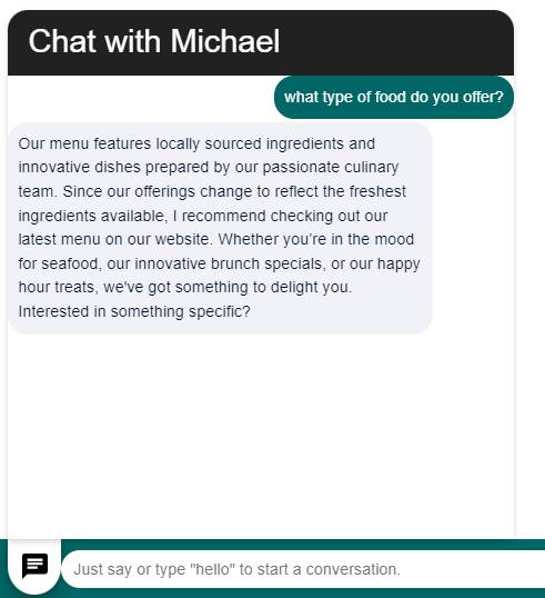
Your Chat Transcript box has a header (title) you can customize. Enter the text you’d like for that header here.
Text Placeholder #
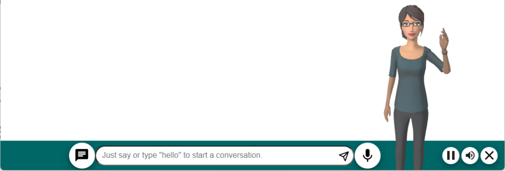
This is the text that appears in the textbox before the user starts to type or speak.
Interface Style #
We have created some default UIs that your avatar will use on your site. You can select one here. If you are using our API and are creating your own UI for your site or application, choose the “Avatar Only” option.
Modern UIs
- Base Bar Interface
- Compact UI
- Conversation Focused
- Total Canvas
- Wave Flow Design
- Wave Total Canvas
Legacy UIs
- Avatar Only – Avatar will resize to the container of the website.
- Bottom Bar – Displays the input text line at the bottom of the browser.
- Bottom Bar with Opaque Avatar – Displays the input text line and avatar at the bottom of the browser.
- Large Chat (Dark Mode) – Displays the text window with a light background and the avatar with a dark background.
- Large Chat (Light Mode) – Displays the text window with a dark background and the avatar with a light background.
- Minimized – Displays the text window collapsed.
UI Container #
This is the DOM object (Document Object Model ) on your site / app where you would like the avatar and its UI to appear. Typically, this will be in the body, but if you are creating your own UI or would like the interface to appear elsewhere (in a specified < div >, for example), you can indicate that here. This is a CSS selector so to specify an object by id use ‘#myObjectId’. This field only works in conjunction with the UI Style when using the Avatar Only option.
Automatically Re-Enable Microphone #
If “yes” is selected, the microphone will be auto re-enabled after the avatar finishes a response. This action will only take place if the previous question was asked using the microphone.
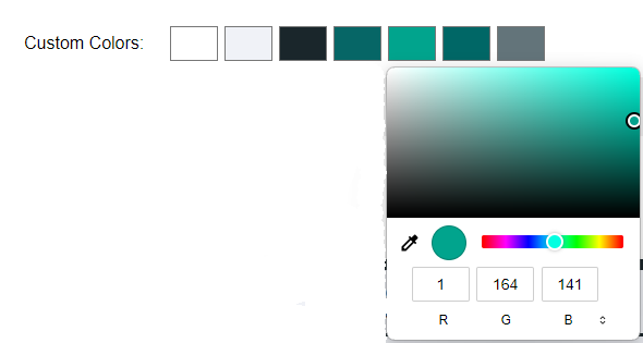
Custom Colors #
Custom Colors displays color chips for the current colors in the color palette. Selecting on a color chip displays a color palette editor. The color for that chip can be modified using the color palette editor. The number of color chips displayed depends on the options selected for Interface Style because different Interface Styles include different numbers of user interface components.
CSS Overrides #
Show/Hide CSS #
Selecting the Show CSS displays the CSS code in an editable text box.
Your selected UI will include default styles your interface will use. This overrides section lists the styles that are most commonly customized. If you need further customization, you can identify the CSS elements you’d like to override in the default styles for your avatar and add them in here, as well.
Note: There are two cameras included in Character/Cameras and Loading Images: one is a fullbody and one is a headShoulders. Either one can be specified in CSS Overrides for camera.
The CSS file is divided into different sections for the different components in the user interface.
Common #
/* common css */ – Use the Common section to apply properties to everything.
Bottom Bar #
/* bottom-bar component */ – Use the Bottom Bar section to apply properties to the bar that contains the Ask Input component. Properties such as position, size and color can be modified.

Ask Input #
/* ask-input component */ – Use the Ask Input section to apply properties to the Ask Input bar. Properties such as position, size and color can be modified.

Microphone #
/* avatar-microphone component */ – Use the Microphone section to apply properties to the microphone button. Properties such as cursor shape, position, size and color can be modified.

Avatar Container #
/* avatar-container component */ – Use the Avatar Container section to make changes to the container that displays the avatar. Properties such as position, size and padding can be modified.
Chat History Button #
/* chat-history-button component */ – Use the Chat History Button to apply properties to the Chat History Button. Properties such as position, size and color can be modified.

Chat Container #
/* chat-container component */ – Use the Chat Container section to apply changes to the Chat Container. Properties such as position, size and font can be modified.
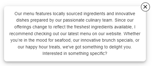
Chat Bubble #
/* chat-bubble component */ – Use the Chat Bubble section to apply properties to the Chat Bubble. Properties such as position, size and font can be modified.
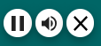
Buttons Controls #
/* button-controls component */ – Use the Buttons Controls section to apply properties to the Control Buttons. Properties such as padding can be modified.
Screens #
/* screens 1250px or higher */ – Use this section to apply properties if the screen resolution is greater than 1250 pixels.
/* screens 650px or higher */ – Use this section to apply properties if the screen resolution is between 650 pixels and 1250 pixels.
/* screens 0px or higher */ – Use this section to apply properties if the screen resolution is between 0 pixels and 650 pixels.


